The World Is Colourful: Cruentis at The Brick Lane Gallery, London
In October 2025, two of my works hung on a white wall in East London. Five days at 216 Brick Lane, alongside the colour photography of Jim Pietrangelo.
I am writing this down because looking back brings a few things into view that you never see on a finished opening night. The decisions that came first. The materials. The friendship without which none of it would have happened.
And because two pictures on a wall have a story worth telling.
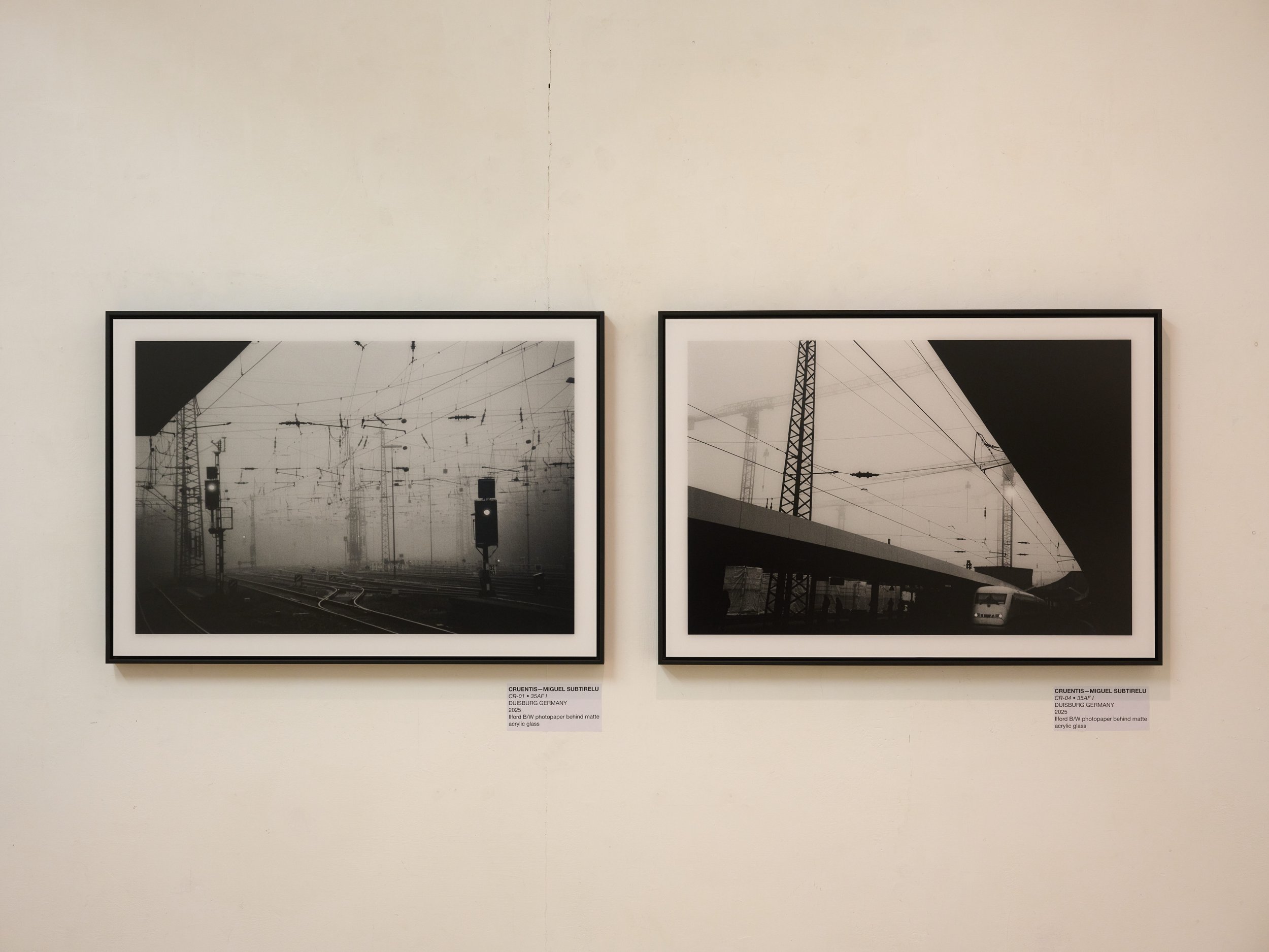
CR-01 and CR-04, both 35AF I, Duisburg 2025.
Ilford black and white photographic paper behind matte acrylic glass, black shadow gap frame, motif 60 x 40 cm
The invitation came from a friend
Jim Pietrangelo is a lawyer, American, and has been photographing since 2014. We met through photography, and what began there became a friendship that means a great deal to me.
He calls his visual language Etherealism. Scenes held exactly as the eye saw them at the moment of capture, without later manipulation, and painterly all the same. Light and colour do the real work in his pictures.
When Jim asked whether I would come to London and exhibit with him, I did not need long to decide
That our work is so different was the point rather than the problem. He works in colour, atmospheric, soft, often in nature. I work in black and white, hard, industrial, usually in places where nobody stops of their own accord.
Side by side on one wall, that adds up to more than either does alone. That is what The World Is Colourful was about.

With Jim Pietrangelo at The Brick Lane Gallery, in front of his prints on Hahnemühle Rag.
Two works from Duisburg
I brought two pictures with me. Both from Duisburg, both made in 2025, both from the series 35AF I.
CR-01 shows a rail yard in fog. Overhead lines dissolving into white towards the back. Two signals, one of them lit, the only bright points in a picture otherwise built entirely from grey and black. It is a very quiet place, even though something is moving through it at all hours.
CR-04 is the harder of the two. A bridge cuts diagonally across the frame, a black triangle sits above it, and below a train comes out of the dark. Cranes in the background, fog again. Here the geometry carries the picture rather than the mood.
Both motifs measure 60 x 40 cm. Printed on Ilford black and white photographic paper, behind matte acrylic glass, in a black shadow gap frame.
Why this combination of materials
These are three decisions you do not notice on a screen and notice immediately on a gallery wall.
Matte acrylic glass instead of gloss. Galleries work with spotlights. Standing in front of a dark black and white image behind glossy glass, what you mostly see is yourself and the ceiling lights. Matte acrylic removes the reflection and lets the shadows stay deep. The cost is a slightly softer impression from very close range. On a motif already set in fog, that is not a loss.
Ilford black and white photographic paper instead of inkjet. Real photographic paper, exposed and developed. The blacks build denser and the transition into the greys runs more evenly than with most inkjet processes. In a picture made largely of black and fog grey, that is precisely what decides how it reads on the wall.
A black shadow gap frame. The frame does not touch the print. A narrow gap of air sits between the frame edge and the image, so the print appears to float inside it. No mount competing for attention, no visible overlap. For industrial motifs with clear geometry, it is the quietest solution there is.

The Cruentis wall with information panel and QR code.
Limited edition prints, made in Germany.
Supported by WhiteWall
The prints were produced by WhiteWall. A black panel at the entrance carried both our names and the line Printed by WhiteWall.
WhiteWall also covered the opening night on their own social media channels.
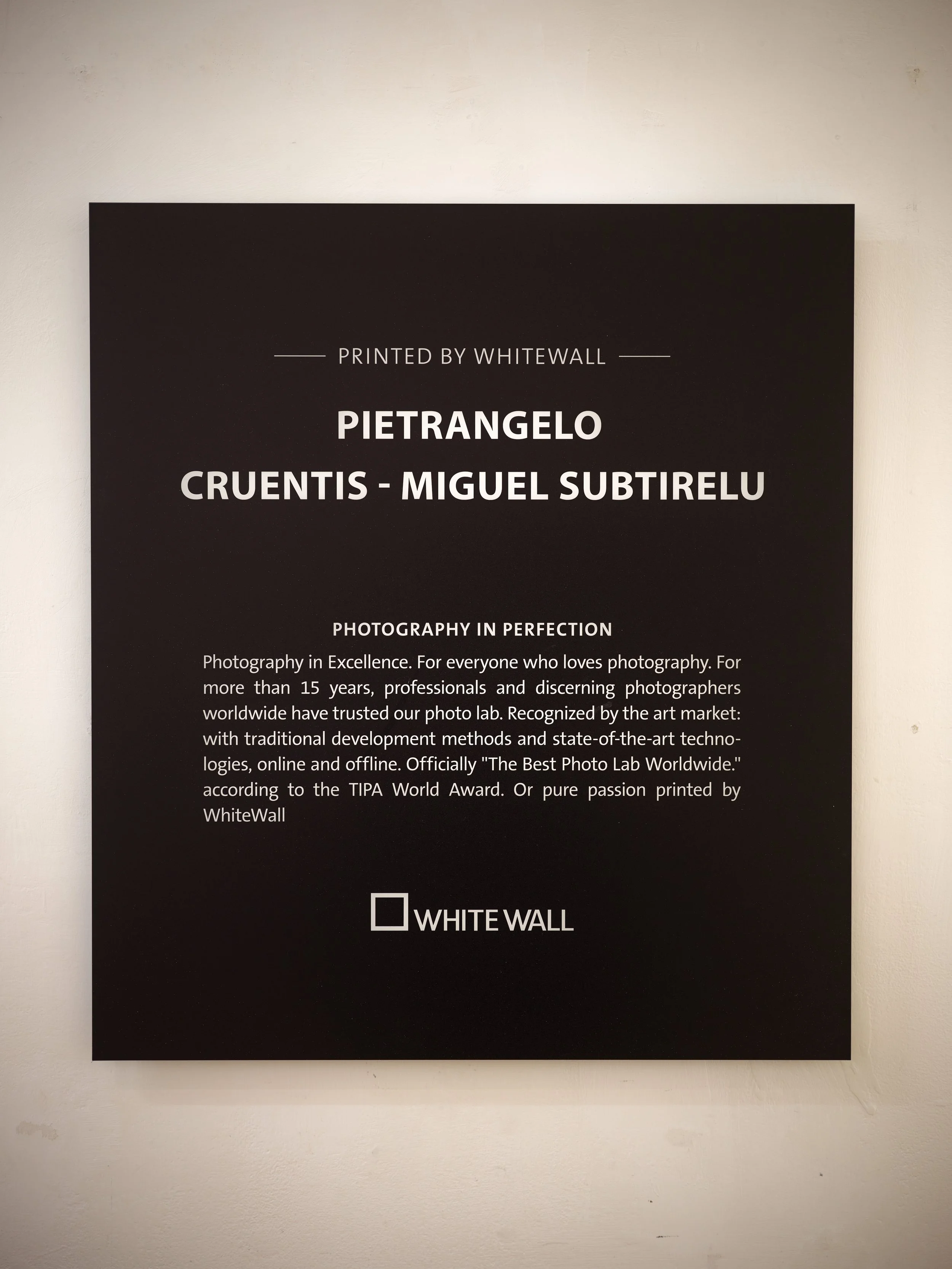
The exhibition panel at the entrance.
Printed by WhiteWall.
Opening night, 8 October
Six until half past eight, with drinks, in a room that filled up quickly.
More people came than I had expected. Glasses in hands, conversations running between the walls, and again and again someone standing in front of one of the fog pictures for a long while before asking where it was taken.
Duisburg, I tell them. And almost always the same reaction follows, which is that they would not have expected that.
That is exactly the point for me. The Ruhr region is not a postcard.
But in the right light, at the right moment, a rail yard becomes something you hang on a wall.
That is not romanticising it. It is a question of looking properly.
The atmosphere that evening was open and welcoming. It did not feel like an examination. It felt like a room where people had brought time with them.
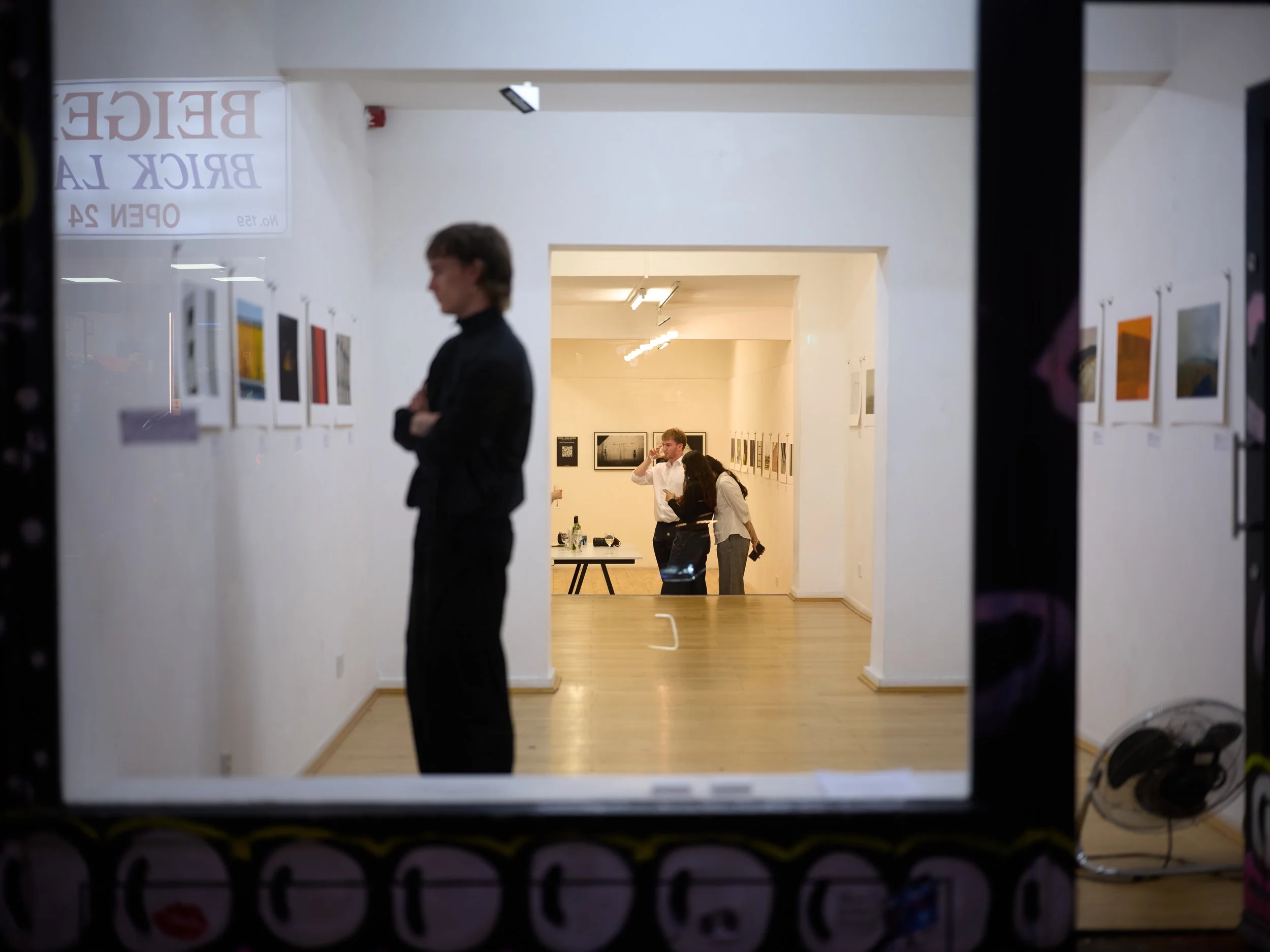
Looking in from Brick Lane on the opening night.
The time in London
I travelled first class. It is not something I would have booked for myself, and it made the beginning of the trip unexpectedly calm.
You arrive differently when you have had room to think on the way.
Jim and I spent the days that followed on foot. London is a city best walked, and we walked a great deal of it. In between, the classic black cabs, which are exactly as you imagine them.
We went to Tate Modern together. Hours of it, in front of a many great works, with the kind of conversation you can only have with someone who also photographs. I rarely leave a museum like that with a finished conclusion, but always with a different way of looking than the one I came in with.
What I took away
An exhibition makes your own work real in a way an online shop never can. A print on a wall, at the right size, under gallery light, with a stranger in front of it saying nothing for two minutes. That is a different measure entirely.
It also confirmed what I insist on with the editions. Paper, glazing and frame are not details. They decide whether a picture holds a wall or merely hangs on it.
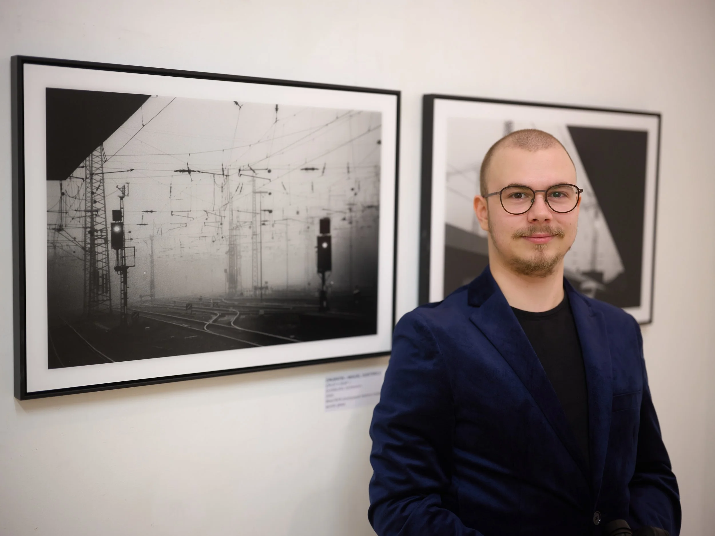
In front of CR-01 and CR-04, The Brick Lane Gallery, London.
EXHIBITION DETAILS
Exhibition: The World Is Colourful
Artists: Jim Pietrangelo and Miguel Subtirelu (Cruentis)
Venue: The Brick Lane Gallery, 216 Brick Lane, London E1 6SA Dates: 8 to 12 October 2025
Opening night: 8 October 2025, 6:00 pm to 8:30 pm
Works shown by Cruentis: CR-01 and CR-04, series 35AF I, Duisburg 2025
Production: 60 x 40 cm, Ilford black and white photographic paper, matte acrylic glass, black shadow gap frame
Printed by: WhiteWall
Frequently asked questions
Which Cruentis works were shown in London?
Two black and white photographs from Duisburg, CR-01 and CR-04 from the series 35AF I, both made in 2025.
Each motif measures 60 x 40 cm.
What material are Cruentis editions printed on?
On Ilford black and white photographic paper. This is genuine photographic paper, exposed and developed rather than inkjet printed.
The result is a denser build of blacks and more even transitions through the grey values.
Why matte acrylic glass rather than ordinary picture glass?
Matte acrylic prevents reflections from spotlights and windows. With dark black and white motifs this matters a great deal, because on a glossy surface you mostly see the room rather than the picture. Acrylic is also considerably lighter and more break resistant than glass, which makes shipping and wall mounting easier at larger formats.
What is a shadow gap frame?
A frame in which a narrow gap of air remains between the frame edge and the print. The image never touches the frame, so it appears to float inside it. There is no mount and no visible overlap, which keeps the presentation quiet. It suits geometric and industrial subjects particularly well.
Are the works shown in London available as editions?
Yes. CR-01 and CR-04 are part of the Cruentis limited editions, each numbered and supplied with a certificate of authenticity. Handcrafted in Germany.
Thanks
To Jim Pietrangelo, for the invitation, the days in London and the friendship. To The Brick Lane Gallery for the space and the care they took. To WhiteWall for the support. And to everyone who came that evening and gave the work their time.